Project Overview
Yemvi Exports is an India-based agricultural export company focusing in luxury spices, essential oils, and cashew products. The brand focuses on quality assurance, ethical sourcing, and reliable global delivery, offering properly processed and export-ready products to foreign markets.
Problem
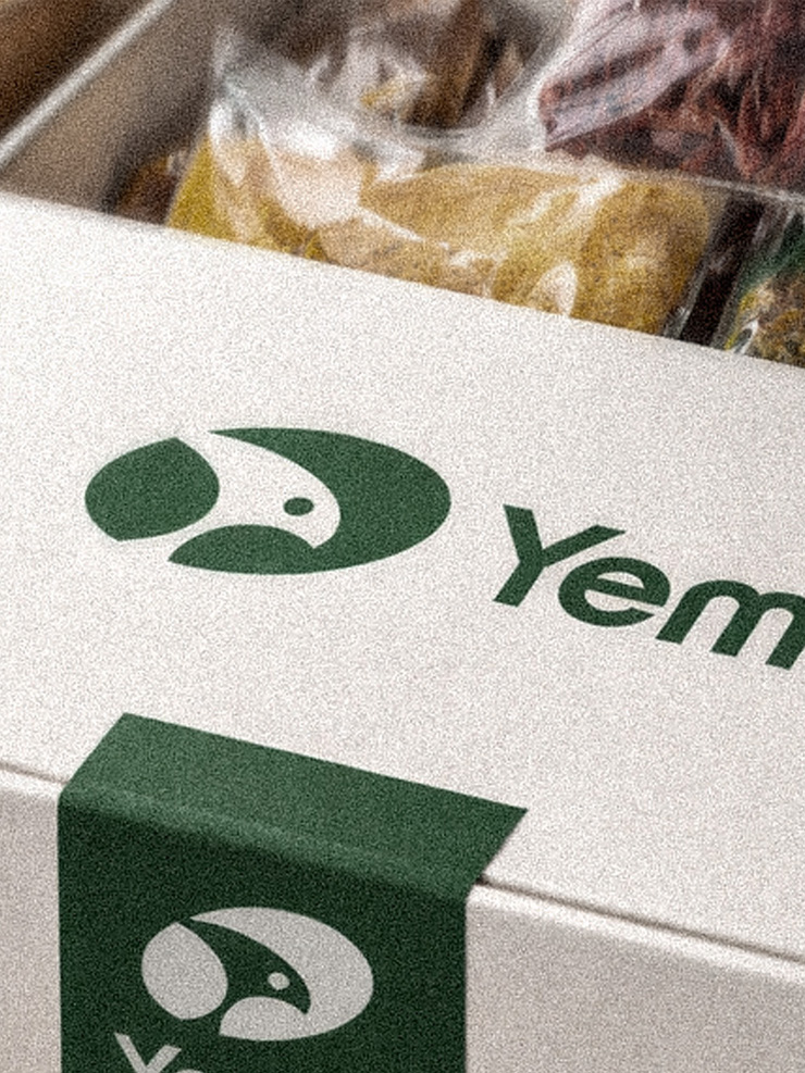
The brand does not currently have a strong or consistent brand identity that reflects its vision and future goals. Its existing wordmark logo feels outdated and relies on very basic, obvious typography, which does not communicate quality, trust, or modernity. As a result, the brand lacks a distinctive visual presence and struggles to stand out in a competitive market.
Research & Strategy
After understanding the problem, we researched the competitors and the current export market. This helped us see what most brands look like and how they position themselves. Using these insights, we created a branding direction that helps the brand stand out with a more modern, unique, and professional identity that reflects its quality and vision.
Solution
we defined a clear direction for the brand. We focused on creating a unique identity supported by a premium, luxury color palette. This approach helps the brand stand out in the export market and positions it as a high-quality and trustworthy brand.
Results
We designed a new logo using a falcon icon as the main symbol. The falcon face represents sharp vision, trust, and a strong global focus. A premium green color was chosen to express freshness, quality, and reliability. We paired it with clean sans-serif typography to keep the brand modern and friendly, making the products feel accessible and easy for everyone to trust and choose.
